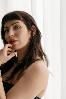
The moment has finally come – my new design is online!
It‘s been quite a journey, one that actually took me several months from ideal completion. I changed everything from the ground up. As you can see, it‘s very different to my previous layout, visually. But the really crucial changes are internal. All in all, it was much more work than I thought it would be.Well, I guess since I turned my entire life upside down recently, which also means that I no longer feel like the woman I was two years ago, redesigning my blog became a really important project to me. I would really like to take the opportunity and thank my boyfriend David, who pretty much designed the entire blog, and who opened my eyes to so many facets of this platform. I‘d also like to thank my programmer Melchior, who was able to fulfill every wish I had over the past few years, no matter how bizarre my requests. Thank you for always finding a solution!
Now let‘s look at the changes.
The old design had two major disadvantages:
1
The Time Factor
Every single blog post took me ages. Each and every time I needed to come up with anew layout, which meant coding. Every. Single. Time. And when I say it took ages I really mean it. Some of the more visually involved posts easily took me8 hours to design (and that is after the text was written and the photos were ready). The coding process can get pretty complex, and I am one to go into detail. Unfortunately I could not really delegate this job to anyone. Over timeI just felt less and less motivated to spend entire days on single blog posts, not least because I felt that all this work is ultimately less widely appreciated than for example my Instagram feed, which also swallows a lot of time in maintenance by the way, but far less than the individual blog posts did. The cost-benefit balance just got out of whack, which was detrimental to my overall motivation towards the blog and lead me to set other priorities. And, you know, my blog is no longer the only outlet I have, since I became more active on other channels like my podcast and my Instagram feed, neither of which existed in my life a few years ago. So, yes, I needed to find a solution, a setup that would allow me to focus on writing instead of coding, a solution that would allow me to outsource the layout when necessary. That was a stipulation, by the way: I wanted to retain a creative, unique layout. What I have now is a solution tailored to my needs, coded to spec, a site with a modular, nested principle which is very effective (once one has gotten the hang of it). This blogpost you are reading took me one hour to assemble… not bad, right?
2
Mobile Version
Let‘s be honest here: the mobile version of my blog wasn‘t all that snazzy. More and more often I asked myself why I spent so many hours coding when in the end only 20-30% of readers see the desktop version anyways. It became glaringly obvious that I needed a new mobile version, which is why we actually applied an entirely different design principle and conceptual approach this time: mobile first. Now, every single blog post won‘t just look great on the desktop, it will translate beautifully to mobile. Yippie!
And there are other changes on my blog as well:
This blog symbolizes a radical new start, which meant the old logo needed to give way to a new one. I was actually considering using some kind of signature to stress the personal angle in my writing, but after scribbling my name for like1000 times without hitting on anything I liked I settled on a designed logo that is reasonably close to my handwriting.
Listening!
I will present selected posts – especially the critical Sunday posts – in audio format as well. In other words, you’ll have the option to listen instead of reading, if you so choose. Just subscribe HERE and you‘ll always get the latest updates.
There‘s an outfit section now
Once again, let‘s be honest. No one wants to see outfit posts anymore. Why would they? The old outfit post category was another relic that left me increasingly void of inspiration. What was I supposed to write other than „I like it and that’s whyI combine these garments.“ Usually there just isn´t more to say, and I gradually stopped doing outfit posts forthat reason. At the same time I feel it’s a shame to have all these great pics and looks gather dust on my hard drive, and Instagram alone is not enough. The solution: I integrated a new outfit category, where you can check out individual outfits. And if you see something you like simply click on the outfit and you’re redirected to more detailed info and a shopping option. Easy!
Legibility!
I received the frequent feedback that my blog is difficult to read, and for that reason we chose different, more legible fonts in our overhauled design. Random fact: choosing the right font was one of the most time-consuming tasks in the whole redesign process. Finding a font that represents me broadly but is also unique and not one of the run-of-the-mill fonts out there was definitely a challenge. Well, we looked at about a million samples and eventually settled on the font you are now looking at.
The podcast is integrated
From here on out, you‘ll always find the newest episode of the podcast on the start page
What remains:
Newsletter
I will continue to send out newsletters! Not every week, but once a month, with all the latest updates.
Subscribe HERE.
Personal posts
I hardly ever offer blog posts to clients at the moment, in order to have more freedom to devote this space to personal posts, which, after all, is the basis of this blog
Multilingual
I will continue to publish this blog in three languages: German, English, Russian.While most of my readers are based in the German speaking world, multilingualism is a matter of the heart for me.
